
Work That Sets Us Apart


An intuitive interface to dramatically increase online leads
The Opportunity
To deliver a modern and intuitive website designed to drive traffic and online sales.
The Human Lens
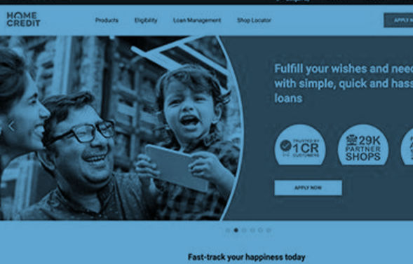
To understand why enough customers weren’t clicking on Home Credit, we deep-dived into the existing website design, inspecting it from every possible angle. The biggest problem, we discovered, was navigation. Customers weren’t able to easily find what they were searching for. In addition, there was lack of a clear ‘Call-To-Action’ across the website. After having identified the problems, we went about fixing them.
How We Shaped Behaviour
We began with creating a design that appealed to the target audience‘s sensibilities. We then focused on developing a well-crafted navigation, search functionality, easy purchasing paths and strategic merchandising placement. We placed the revamped ‘Products & Services’ section front and centre, and also added a ‘Store Locator’ for customers who needed immediate service. Additionally, interactive features such as ‘Apply for Loan’ forms and a Chatbot were introduced to drive sales and increase the number of online leads and enquiries.
The Success Story
A post campaign brand study revealed that we achieved:
- 38K More daily page views
- 12K More daily visitors
- 40% Reduction in overall bounce rate

 Indigo Consulting
 @indigo_cons
 Indigo.consutling
 Indigo Consulting
