
Work That Sets Us Apart
The Opportunity
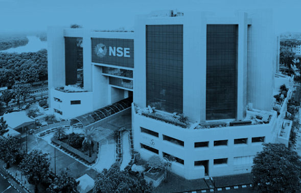
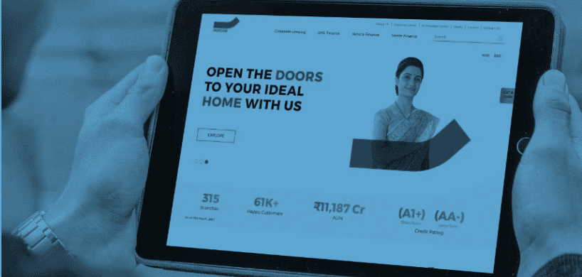
To redesign NSE’s website with the objective of offering a seamless and user-friendly experience for millions of consumers.
The Human Lens
We started by determining the issues plaguing the existing website. We did so by identifying and reaching out to 8 unique personas across the country who were ‘key visitors’. After listening to their feedback, we came to the conclusion that there were five main areas of improvement – data error, verbose content, restrictive design, tag glitches and complicated navigation – which essentially meant that consumers couldn’t find what they were looking for. Then, we went about fixing them.
How We Shaped Behaviour
We adopted a 3E approach of ‘Empathise, Educate, Empower’. Once we double-clicked on each of these, we were able to chart the needs of each user group, solve the issue of finding data and map user journey. We did all of this using the best tools - Drupal 8 for content management and Node.js for programming. Every aspect of the redevelopment journey was completed in compliance with the web content accessibility guidelines. Finally, we moved the entire database to a redesigned information infrastructure to deliver a frictionless user experience.
The Success Story
A post campaign brand study revealed that we achieved:
- 34% Jump in URL rating score
- 50% Less time required to access information
- 14% Point rise in positive sentiment
Awards

2019
Best Use of Website
DMA Asia ECHO 2019
Best Use of Website
DMA Asia ECHO 2019

 Indigo Consulting
 @indigo_cons
 Indigo.consutling
 Indigo Consulting


