
Work That Sets Us Apart


Website redesign that quintupled site visits
The Opportunity
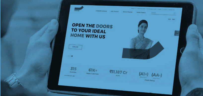
Design a website to improve traffic and increase the frequency of transactions made online.
The Human Lens
Due to the complicated nature of the old website, customers were moving to other platforms to transact. In some cases, this had even resulted in loss of business. As more and more people use their phone to access the internet, we realised that the need of the hour was to create a mobile-first website that was easy to navigate.
How We Shaped Behaviour
We set about designing a mobile optimised website that delivered on multiple usability characteristics. We adopted a digital-first transaction approach aided by the latest content management system, a well-planned information architecture and effective navigation to ensure a seamless experience for all visitors. We also made sure that the website had a fast load time as a lot of customers drop out because of poor speeds. Putting all of these together helped us create a user-friendly interface where customers could transact hassle-free.
The Success Story
A post campaign brand study revealed that we achieved:
- 195% increase Monthly website visits
- 5.6% to 9.1% Improvement in CTR

 Indigo Consulting
 @indigo_cons
 Indigo.consutling
 Indigo Consulting
